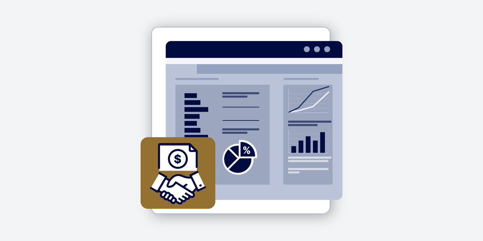
What’s New at CFI | Excel Data Visualization & Dashboards
Turn Raw Data Into Executive-Ready Stories
Excel is the foundational tool for analysis, but simply having data isn’t enough; you need to tell the story behind the numbers.
In this episode of What’s New at CFI on FinPod, CEO Tim Vipond introduces the new Excel Data Visualization and Dashboards course. Learn how to transform raw data into clean, clear, and powerful visuals that drive business decisions, no matter your industry.
This course is a masterclass in building executive-ready dashboards from scratch, making it essential for FP&A, Marketing, Operations, and all analytical roles.
This episode covers:
- The Power of Excel: Why Excel remains the ultimate “blank canvas” for visualization and the foundational skill set for tools like Power BI or Tableau.
- Mastering the Visual Toolkit: Learn to build and use advanced charts like Waterfall Charts (for variance analysis), Combo Charts (for margin vs. revenue), Sparklines, and Football Field Charts (for valuation ranges).
- End-to-End Dashboard Creation: Gain the confidence to plan, set up, and build complete, beautiful dashboards that are clearly sectioned, titled, and formatted for maximum impact.
- Highlighting Insights: The critical skill of moving beyond just building a chart to actively using color, arrows, and annotations to highlight the specific insights that drive business change (e.g., maximizing margins or accelerating growth).
- Developing Taste: Tim shares career advice on how to develop “good taste” in data visualization by actively seeking out and being inspired by varied internal and external reports (pitch decks, board reports, operations decks).
Transcript
Meeyeon (00:02)
Hi everyone. And welcome to a, another episode of what’s new at CFI, the podcast series where we talk about quite literally what is new at CFI, all the newness and goodness that we have.
I’m your host, Meeyeon. You’ve heard me and seen me here before. And today I’m joined by the most familiar face, CFI’s co-founder and CEO, Tim Vipond. And we’re going to talk about our newest course called Excel Data Visualization and Dashboards. And this course, as you might be able to tell by the name, is all about taking raw data in Excel and turning it into clean, clear visuals that’ll help you tell the story behind the numbers and data. Tim, thanks for joining me here today. Let’s…
Jump right in.
Tim Vipond (00:45)
Yeah, my pleasure. Thanks for having me on, Meeyeon. I’m super excited to talk to you about this. I’m quite passionate about data visualization and dashboard building. I’ve had to do it a lot in my career, whether I was working as an FP&A analyst or I was working as a VP of finance. You know, the amount of visuals that you have to create is such a big part of the job. And being able to tell that story with clear visuals, help people get to insights from those visuals you’ve created is so powerful. So yeah, I’m excited to walk through this with you.
Meeyeon (01:19)
And so this course, when I’ve kind of seen it from the behind the scenes develop, something that really stood out to me was while the course is set in a corporate finance context, because we are CFI, I thought that this course would genuinely be helpful for anyone in any sort of analytical role. Like you’re learning it in a corporate finance context, but
whether you are in marketing or in like supply chain, any role that is remotely analytical, which is every role today, I found that this course would be so helpful because it is working in the tool that is the most kind of foundational and basic tool that we have, which is Excel. Not everyone is going to use things like Power BI or other types of software,
Tim Vipond (01:55)
Mm-hmm. Mm-hmm.
Totally agree.
Meeyeon (02:14)
but everyone is going to use Excel. And I think that is something that is incredibly powerful. And while it is, I guess it might be considered kind of old school for some people these days as like more and more programs come out. But I think that it is very, very practical to have the course entirely based on Excel. And I just wanted to get your thoughts on that.
Tim Vipond (02:36)
Yeah, I think you made two great points, Meeyeon. The first is that this is applicable beyond finance careers, even though it’s a case study around corporate finance information and data.
So it applies to like any kind of analytical or corporate office function, you might say. And then the second thing is that the fact that it’s in Excel means it’s this foundational skill set that you’re building that you can then use with other tools like Tableau or whatever kind of visualization software you might use in addition to Excel. But learning these fundamental skills, Excel is really the best place to do that where you have full control, like you’ve got this blank canvas, you can…
You can create the dashboard in any shape or style you want, pull in the visuals and build them from scratch. It’s just a great way to learn how to make good visuals.
Meeyeon (03:26)
And I find that…
Data visualization and data analysis doesn’t necessarily come extremely naturally for people. It’s something where you have to really practice at it. And the more you see, the better you do. Whether it’s other people’s work or your own, I find that it just takes time in the saddle, so to speak, to become better and better. With this course, I was wondering if you could share with us, what do you think that it helps learners do that they might typically struggle with?
Tim Vipond (03:54)
Yeah, that’s a great point. Like seeing examples of great visuals really helps you and practicing really helps. So this course is going to really tick a lot of those boxes. But examples that come to mind for me are around highlighting key points. So it’s one thing to make a chart, but it’s another thing to highlight a specific part of a story. And you can use color, shape, you could add arrows, boxes, annotations.
There’s all sorts of things you can add on top of a chart that really make a point. So there’s an art to learning that and we cover that quite well in the course. Also, just knowing what types of charts to use is quite helpful. A waterfall chart, for example, is really good at explaining variance or change. And you might not intuitively just come up with that idea to use a waterfall chart to explain like actual versus budget.
But we show you how to do that and then you can see how you really explain why there was a difference between actual results and what the budget was set to be.
Meeyeon (05:03)
And for those of us that may feel a little bit intimidated by the things that we’re talking about, we’ve talked about variance analysis and waterfalls, what is the skill level required for people to get started with this course?
Tim Vipond (05:17)
Look, we provide a high level overview of two types of dashboards that you’re going to build and essentially you just need to have a basic understanding of analysis and Excel. You don’t need to have a strong finance background or be a power user in Excel. We’re going to show you step by step how to build these dashboards. So you’d still benefit from taking it if you’re a power user because we’re going to show you some pretty cool visuals, but by all means, any level is going to be fine.
Meeyeon (05:48)
And speaking of dashboards, maybe you could take us through the high-level structure of the course without giving too much away.
Tim Vipond (05:59)
Okay, yeah, we like to teach by example. So we make two dashboards from scratch end to end. One’s more, you know, of a portrait layout, one’s more of a landscape layout. Each one uses different types of charts and graphs to fill in the space. imagine populating a one page dashboard with six to eight charts or graphs in it.
And it’s, you know, nicely laid out, beautifully formatted with clear title, clear sections, clear takeaways and insights. So, you know, you might get to learn a couple new types of charts that you hadn’t seen before.
Meeyeon (06:40)
And it’s almost like name-dropping, like for, I guess, celebrities, but for charts, when it comes to visualization. Can you give us a couple of types of visuals that are included in the course that learners are to be able to practice?
Tim Vipond (06:47)
Yeah.
Sure.
Sure. mean, just quick ones or your standard stuff, line chart, bar chart, column chart, but then taking those and making combo charts is where it gets really interesting. So if you take a column chart and a line chart, that’s a great combo where you could show like revenue with the columns and margin profile with the line. Okay. Then, then we get into waterfall charts, which are, like I said earlier to show maybe variance analysis or change over time.
We introduced spark lines, which are a really cool little visual. I won’t explain that now. You’ll just have to check out the course to see what spark lines are. A football field, which is a great way to show a range of values for something. Imagine you’re valing a company and there’s all these ranges that you come up with for what the company could be worth. We’ll put that into a football field, which is a fairly custom type of chart. So, yeah, hopefully that gives a good flavor of it.
That’s not all we cover, but that gives you a good sample set.
Meeyeon (07:56)
And for anyone that regardless of what their professional background is or skill level is in Excel, what do you hope that a learner walks away with after completing this course?
Tim Vipond (08:08)
Yeah, that’s a great question. I would say from my perspective, the key things are one, confidence in how to lay out and set up a dashboard. So you’ve got the high level picture of what you want to do and then the detailed understanding of how to go build it from scratch. So you’re planning and you’re set up, then you go build it all. So essentially you can just do end to end dashboard creation at the end of this course. Another thing is that you know how to highlight insights. So once you’ve…
So part one is building that dashboard end to end, you can do that. Part two is spending some time with it, thinking about what the insights are, and then thinking about how you can highlight those insights. Because really the point of the analysis, ultimately in a business, is to affect change, to be able to improve the business, to grow faster, to expand your margins, or whatever it is you’re trying to do. So that’s really the second part of it.
Meeyeon (09:06)
And when it comes to visualizing data and creating dashboards, something that I think is kind of important to consider is that not everything is going to be as grand as creating a full dashboard like the ones that we show in our case studies. But every day, regardless of whether you’re an FP&A analyst, investment banking analyst, any type of analytical role involves
visualizing data for people and being able to show thoughtful analysis and bring it to life visually. It almost goes without saying, but how are some, what are some ways that you think that our learners are going to be able to apply the lessons learned in this right away from day one?
Tim Vipond (09:32)
Mm-hmm.
Yeah.
Yeah. You make a great point, which is that you don’t always put all these visuals together in a full on dashboard. These visuals are useful in all sorts of different places. So to give you some examples, and we could even look at our own company as, an example, like, so on a daily level, we have a daily flash bookings report and that bookings report has some really nice visuals that show pacing and shows how we’re performing relative to our goals and targets, right?
So that would just be a single chart you could make. That’s like a daily use kind of chart. Then, if you look at our monthly reporting cadence, where we have like presentations and decks that have a number of slides and graphs showing performance, okay, you can put it there. Think of quarterly board decks and a quarterly board deck, again, lots of visuals, lots of insights that are trying to be uncovered and displayed. So you don’t have to use these visuals just in a dashboard per se, you can use them.
across your work as a financial analyst, whether it’s like daily stuff or you know big quarterly board reports, it kinda goes end-to-end.
Meeyeon (10:58)
You know what it reminds me of? It brings me back to the early CFI days when we’d have like dashboard analytics on the TV in the office.
Tim Vipond (11:06)
Yeah.
Yeah. Yeah. The scoreboard, the dot, it was like a scoreboard dashboard. Yeah. Well, like, look, if you’re in a startup and you’re in that culture of, like this daily scoreboard dashboard you’re looking at, this course would be great for giving you some ideas on how to do that. You know, or if you’re in a little bit of a more formal setting where it’s like board decks and PowerPoint slides, like, you know, this is going to have you covered for that too. So it kind of works on all levels.
Meeyeon (11:08)
This scoreboard, yeah, that’s what it reminds me of.
And then the last question that I want to pose, and this is, I guess, for both of us to just think about across our careers, is, who is this course for? And I think about, for me, early on in the days when I first started in investment banking, specifically in capital markets, I’d see all sorts of data charts and dashboards, whether it was in Excel, mostly in Excel.
But also in applications like Bloomberg and whatnot, because I was in fixed income, I would always think, How do these people know how to do this? Like, where are they getting these ideas? And at the end of the day, I remember a buddy of mine, he was my associate then, we’re great friends, but he would always say, you know, it’s like, I’m not making this stuff up, you know? Like, it’s not like I’m some sort of genius; this is the first time you’re gonna see this. And the thing that it made me realize was like, truly it is,
Tim Vipond (12:09)
Mm-hmm.
Meeyeon (12:30)
about the more you see, the better you do. And it’s not necessarily about seeing the best top of the line work out there even. It’s just about seeing all sorts of varied analysis, whether it’s good or bad, those are all great learning points and outcomes. And so this course is genuinely for anyone, regardless of what stage of career that you’re at. Generally, I find that the most, the people that are most fluent in data analysis,
are also the most kind of open-minded and the ones that kind of seek information actively all the time. And just by seeing people’s perspectives, seeing different ideas, you just continuously build up this briefcase of knowledge that you have. And then eventually, when you are doing data analysis, presenting it, regardless of what your audience is, whether a peer group of analysts or to your CFO, you have…
Tim Vipond (13:02)
Mm-hmm.
Yeah.
Meeyeon (13:27)
all of these visuals and data analysis sets that you’ve seen that you can kind of cherry-pick from and be inspired by, and then create your own product in the end.
Tim Vipond (13:35)
Yes.
Yes, yes, I love that. I think you’re thinking about it exactly the right way. I have a similar view, which is like, if you think about data visualization as an art, which it is, to be a good artist, you have to have good taste. And to build up taste, you need to see a lot of stuff. So the career advice I would give is wherever you are, get your hands on as much internal reporting or
presentations as you can and flip through those and just be open-minded and curious and look at the visuals and see which ones you could use or modify. Like, most likely you’ll see something here and something else over there, and you’re like, hey, if I maybe combine these or change these, I could come up with a really cool visual. Yeah, exposure is a big part of it. And early on in my career, I did get a lot of exposure, which was great. I remember looking at initiating coverage reports and equity research where there’d be like,
100 charts in that report right and get lots of good ideas or look at pitch decks that other groups had given at your company if you’re in investment banking or something just flipping through other pitch decks could give you tons of visual ideas or if you’re an operating company like an FP&A just look at operations decks marketing decks if you can see board decks whatever you whatever you can get your eyes on you know build up your taste and build up your like you said you’re sort of portfolio of or menu of options that you can draw from.
Meeyeon (15:07)
Yeah, like the bigger the database that you have in your head of all sorts of data visualization, the better that you’ll be in the future. And it just, I feel like it creates this repository that you could be inspired by. And it’s funny when you talk about like picking through like board decks and a bunch of things. just remember being in DCM, I would work with peers in real estate. That was a big topic at that time. But like whether it was real estate or diversified or the M&A team, I would love flipping through their pitch decks.
And generally, the thing that I would do is the data visualization portions are where I would kind of stop and see, like, okay, like what are they presenting, and just like being curious about how they’ve shown it, and understanding, okay, like maybe that’s a good idea. I’ve kind of seen what they’re using that for. And then it’s kind of in my mind for maybe one time in the future when I have an opportunity to apply something in a similar context.
Tim Vipond (16:07)
Mm-hmm, 100%. And it’s almost like I would say when in doubt, if you have a bunch of data, just when in doubt, just try graphing it. Just take something that’s in a table and turn it into a few different types of charts and graphs. And all of a sudden you’ll get a different insight than what you got from the table. Because there’s something about seeing it visually that really gives you a new perspective. So, you know, it’s like to this point about building up the muscle or developing taste.
know, experimentation is also key. So just take all your data, graph it every single way you could graph it. Just try making a scatter plot chart and see if it makes any sense here. If you have, you know, two data sets that you want to get the correlation on or like, you know, just turn it into a bar chart or at, you know, at a combo, make it a combo chart by bringing in some other information and some light bulbs might go off.
Meeyeon (17:02)
Yeah, and that’s such a great point that you make the idea of like, you could just take a data table when it’s just all numbers and a table is really, really helpful. But just by putting it into different visuals, whether it’s a scatter plot, a bar chart, a combo chart, football field where it’s relevant, you’d be surprised at how much additional information you could clean or just you might just see the patterns that you just didn’t see before.
Tim Vipond (17:09)
Yeah.
Yeah, it’s like the pattern like it like a classic example, is if you’re doing a comps table for valuation where you’re looking at say P/E ratios, it’s very common for that to be in a table. I have seen some pitch decks from bankers though, where they graph the table. So the P/E ratios are just like in a chart. And all of a sudden you can see like how clustered they are or if there’s outliers or the shape of the curve or the app the average becomes more apparent. So
It may sound simple, like just graphing anything you can graph could give you a new insight or a new perspective.
Meeyeon (18:04)
Love it. And so if to all of our listeners, if any of what we’ve talked about excites you, this is going to be the best place for you to get your creative juices flowing and develop taste, develop taste for data analysis and visualizations, which can really take you so much further in any part of your career, whether you are in finance and banking or marketing, wherever you might be. So, Tim, thanks so much for joining me today.
To our listeners, if you’d like to build dashboards that look clean, professional, and crisp, executive-ready, I might say, check out our Excel Data Visualization and Dashboards course with Tim, which is live on our website. Thanks for tuning into this episode of What’s New at CFI, and I will see you here next time.
Tim Vipond (18:53)
Thanks, Meeyeon.